Incumbency helps
Take a look at this plot with data from 1948 to 2020.
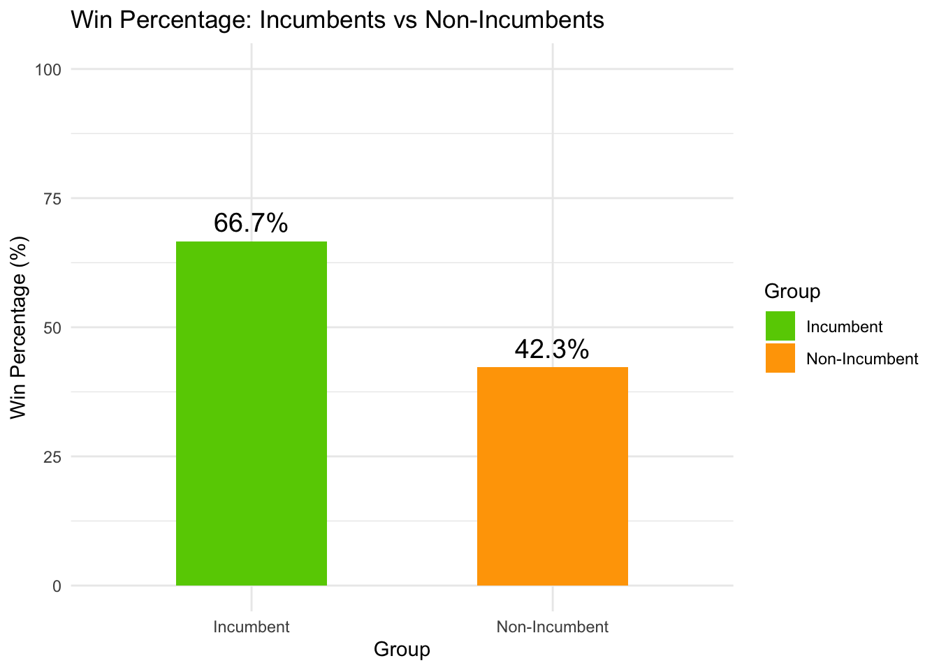
The plot tells us that an incumbent president has an edge over their competitor. This effect is known as the incumbent advantage, and is well-studied in academia. (The incumbent advantage shows up everywhere around the world, curiously except in South America ).
One might argue that there is no incumbent-candidate effect, but merely the incumbent-party effect. Let’s test this theory by looking at the incumbent vs non-incumbent win rate by conditioning on being in a incumbent party
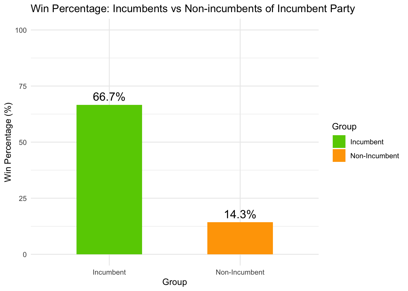 It turns out that non-incumbents in a incumbent party fared worse than the overall non-incumbents! Let’s take a closer look
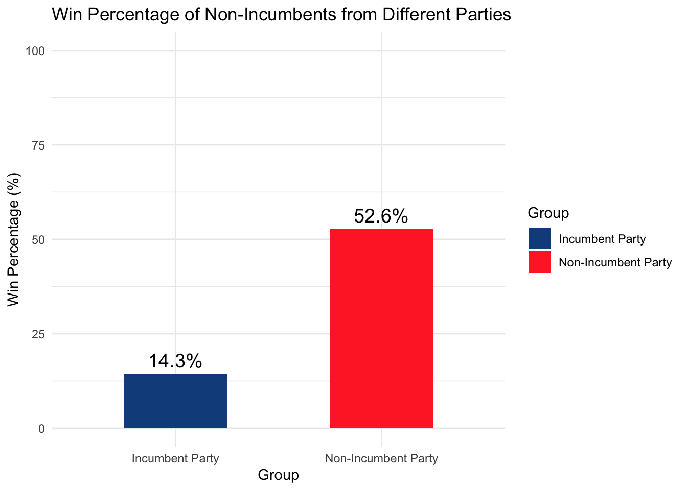
These two plots tell us two things (i) There is an overall incumbent candidate effect: incumbent candidates (66.7%) performed better than non-incumbents (42.3%). (ii) There is a negative incumbent party effect: non-incumbents in an incumbent party (14.3%) performed worse than non-incumbents in a non-incumbent party (52.6%)
Trump is a non-incumbent from a non-incumbent party, while Harris is a non-incumbent from an incumbent-party (hence the color coding above), which means that the effect is acting against Harris.
Let’s figure out what’s causing the incumbency advantage. One hypothesis is that incumbents will award more federal spending grants to key states which will sway votes to their side (academics call this pork-barrel spending). Here we test that effect by plotting the change in vote share vs change in federal spending for counties from 1996 to 2008.
| Estimate | Std. Error | t value | Pr(>|t|) | |
|---|---|---|---|---|
| (Intercept) | -3.0232 | 0.0502 | -60.25 | 0.0000 |
| dpct_grants | -0.0075 | 0.0012 | -6.11 | 0.0000 |
summary(model)$adj.r.squared## [1] 0.00239972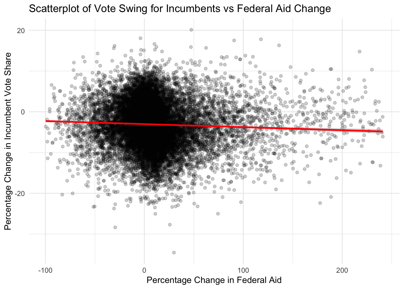
The low \(R^2\) of 0.002 shows that at best, federal spending only explains 0.2% of the vote share. But note the low p-value that is less than \(10^{-10}\), with an estimated effect of -0.007. This means that the model is confident that federal spending decreases vote share by 0.007% for every 1% increase in federal spending! This is the opposite of what we expected. Instead of what the government does (like federal spending), let’s see how the people feel by fitting vote share change against county-level income change
| Estimate | Std. Error | t value | Pr(>|t|) | |
|---|---|---|---|---|
| (Intercept) | -3.1473 | 0.0522 | -60.29 | 0.0000 |
| dpc_income | 0.0635 | 0.0314 | 2.02 | 0.0434 |
summary(model)$adj.r.squared## [1] 0.0002036675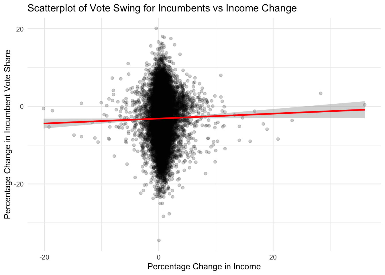
The \(R^2\) is lower, explaining away 0.02% of the variance, but the p-value is at 0.04 with an estimate of 0.06. This means that a 1% increase in income is associated with a 0.06% increase in vote share for the incumbent party. That means that if many counties face an increase in income over the term, the incumbent president will be favored. And indeed this is the case:
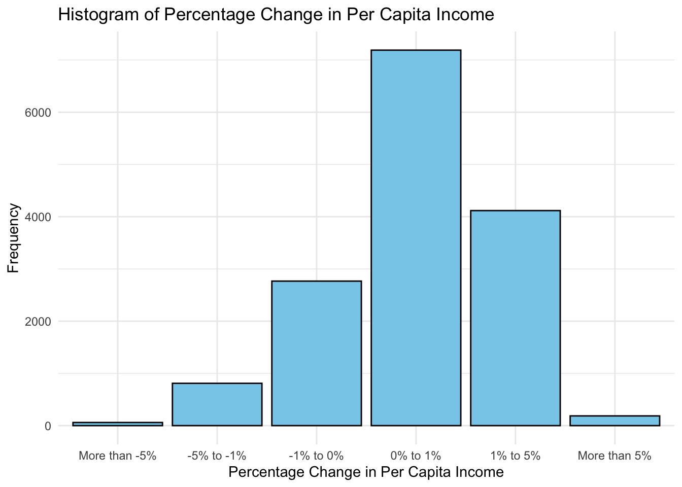
The plot above shows that thanks to the current trend of the modern economy, most counties face an increase in income. It can then be theorized that the incumbency advantage is explained by the momentum of the modern economy making the constituents to reward the incumbent president, whoever they are.
This might be disappointing to some readers, as they would want presidents who tried harder by allocating more federal spending on key states to be favored, but in reality the mechanism of democracy will ensure that those favored are presidents who made the situation on the ground actually better regardless of their federal spending. And because of the modern economy momentum, this is anyone who manages to get into the Oval Office.
Simple models can be powerful
Here’s the Abramowitz’s Time for Change model.
\[ \underbrace{\text{pv2p}}_{\text{incumbent party}} = \beta_0 + \beta_1 \cdot \underbrace{\text{G2GDP}}_{\text{Q2 GDP growth}} + \beta_2 \cdot \underbrace{\text{NETAPP}}_{\text{June Gallup job approval}} + \beta_3 \cdot \underbrace{\text{TERM1INC}}_{\text{sitting pres}} \]
It is a simple linear regression using three variables. Let’s pit this against a random forest, which is a state-of-the-art statistical technique for tabular data. We will use the same three variables: Q2 GDP growth, June Gallup job approval and the incumbency indicator to predict the incumbent party vote share. Let’s test it using leave-one-out cross validation from 1948 to 2020.
## Linear Model LOO-CV RMSE: 4.183061## Random Forest LOO-CV RMSE: 3.59677The RMSE for random forest is slightly lower than that of the Time for Change model. Let’s take a closer look and see how they perform for each year.
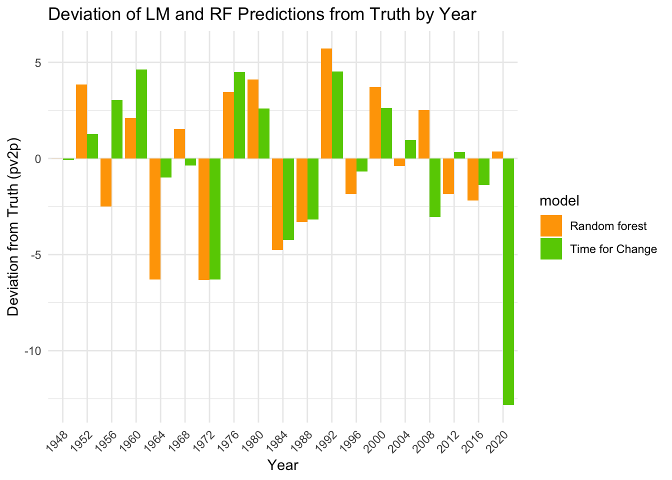 Now it appears that 2020 is a huge outlier for the Time for Change model. Since 2020 is a special year with the COVID-19 pandemic, Abramowitz revised his model to use the following instead.
\[ \underbrace{\text{incumbent party}}_\text{pv2p} = \beta_0 + \beta_1 \cdot \underbrace{\text{June Gallup job approval}}_\text{NETAPP} \]
Now let’s see how does this compare with the random forest, using only one variable.
## Linear Model Lite LOO-CV RMSE: 3.230609## Random Forest Lite LOO-CV RMSE: 3.799247Incredibly, this one-variable linear model has a lower RMSE than our random forest. Perhaps even more surprisingly, this linear model even outperformed our two models above! It recorded a RMSE of 3.23 against the other models having RMSE 4.183061, 3.59677 and 3.799247.
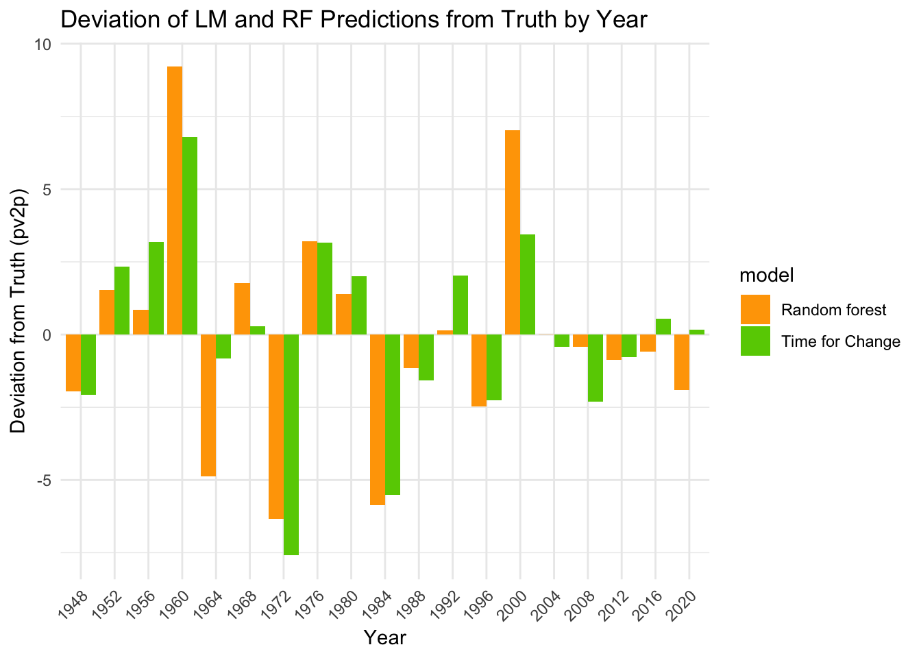 Indeed, it appears that the simple model is closer to the truth than the complicated random forest model for most years. One might be tempted to ask the forecasters to pack their bags and crown the linear model with approval ratings as the best model, but let’s take a closer look at the \(R^2\) for the whole dataset.
summary(lm(pv2p ~ juneapp, popvote_incumbent_party))$adj.r.squared## [1] 0.6490102The simple model can explain away 64.9% of the variance, but there is still work to be done on the 35.1%, where we can use this simple model as part of an ensemble model to reduce the variance. Moving on, let’s look at other expert predictions, Sabato and Cook, from their performance on their predictions.
Expert predictions are accurate
Here are the historical performances of Sabato and Cook from 2004 to 2020.
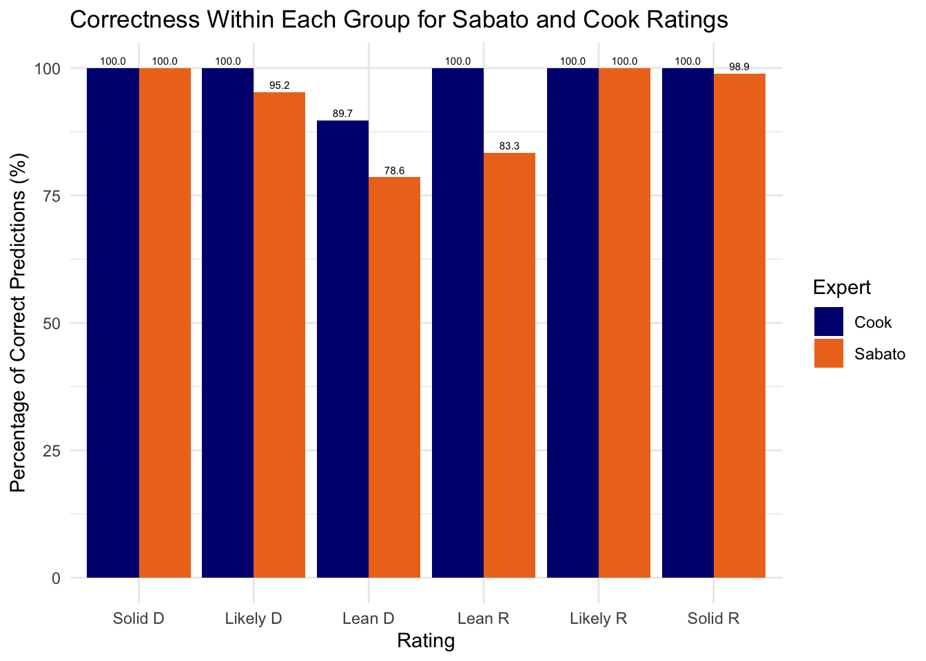
Cook predictions are spot on with 100% accuracy, except for Lean D groups where Democrats only won 89.7% of the time. Sabato’s accuracies are lower, with 78.6% for Lean D, and also 95.2% for Likely D, 83.3% for Lean R and 98.9% for Solid R. The nice dip in the middle shows that the confidence reported by these sources are roughly correct. Now the question begs: why is Cook more accurate than Sabato? In our plot above, we can’t evaluate their performances when a state is categorized as a Toss-Up. Here’s a plot of the number of toss-ups categorized by each source over time.
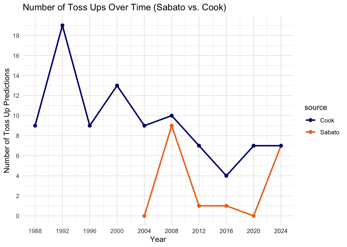
It turns out that Cook has more toss-ups over the years than Sabato. In other words, Cook is playing it safe while Sabato is calling more bets, which can explain some part of why Sabato is less accurate: because Sabato is taking on more risks.
In the history of Sabato predictions, 2024 has the highest number of toss-ups (7) compared to the past three elections, until 2008 with Obama’s election having a higher toss-up count of 9 states. For the first time, Cook also agrees with Sabato with the same 7 toss-up states in 2024 (this might suggest that other states are facing political calcification). But with 7 states on the fence, this means that this election is the most uncertain election in the past 12 years.